Live Prediction of Traffic Accident Risks Using Machine Learning and Google Maps
Traffic accidents are extremely common. If you live in a sprawling metropolis like I do, chances are that you’ve heard about, witnessed, or even involved in one. Because of their frequency, traffic accidents are a major cause of death globally, cutting short millions of lives per year. Therefore, a system that can predict the occurrence of traffic accidents or accident-prone areas can potentially save lives.
Although difficult, traffic accident prediction is not impossible. Accidents don’t arise in a purely stochastic manner; their occurrence is influenced by a multitude of factors such as drivers’ physical conditions, car types, driving speed, traffic condition, road structure and weather. Studying historical accident records would help us understand the (potentially causative) relationships between these factors and road accidents, which would in turn allow us to build an accident predictor.
Fortunately, several of such accident records are publicly available! For instance, the UK government has published detailed records of traffic accidents in the country dating back to 2002. With this data set, my teammates and I have created and deployed a machine learning model that predicts with high accuracy as to when and where accidents are likely to occur in Greater London.
In this article, I will take you through the process of completing this project. The complete code can be found in my GitHub repository, while the live model can be accessed at this website. You can find a copy of this article in Towards Data Science.
Objective
Before embarking on this project, we set ourselves a clear objective: we wanted to create an interactive traffic accident predictor that would be easily accessible by anyone. We decided that the best way to achieve this goal was to deploy a trained predictor on a website. This predictor-website should be capable of doing the following:
- Allow users to input an origin and a destination (both of which have to be in greater London) and find the best driving route that connects the two.
- Allow user to pick the date/time they plan to make the trip and identify areas along the route that are particularly accident-prone within that time window.
The steps we undertook to achieve this objective are depicted in the diagram below. I will elaborate them in the sections that follow.
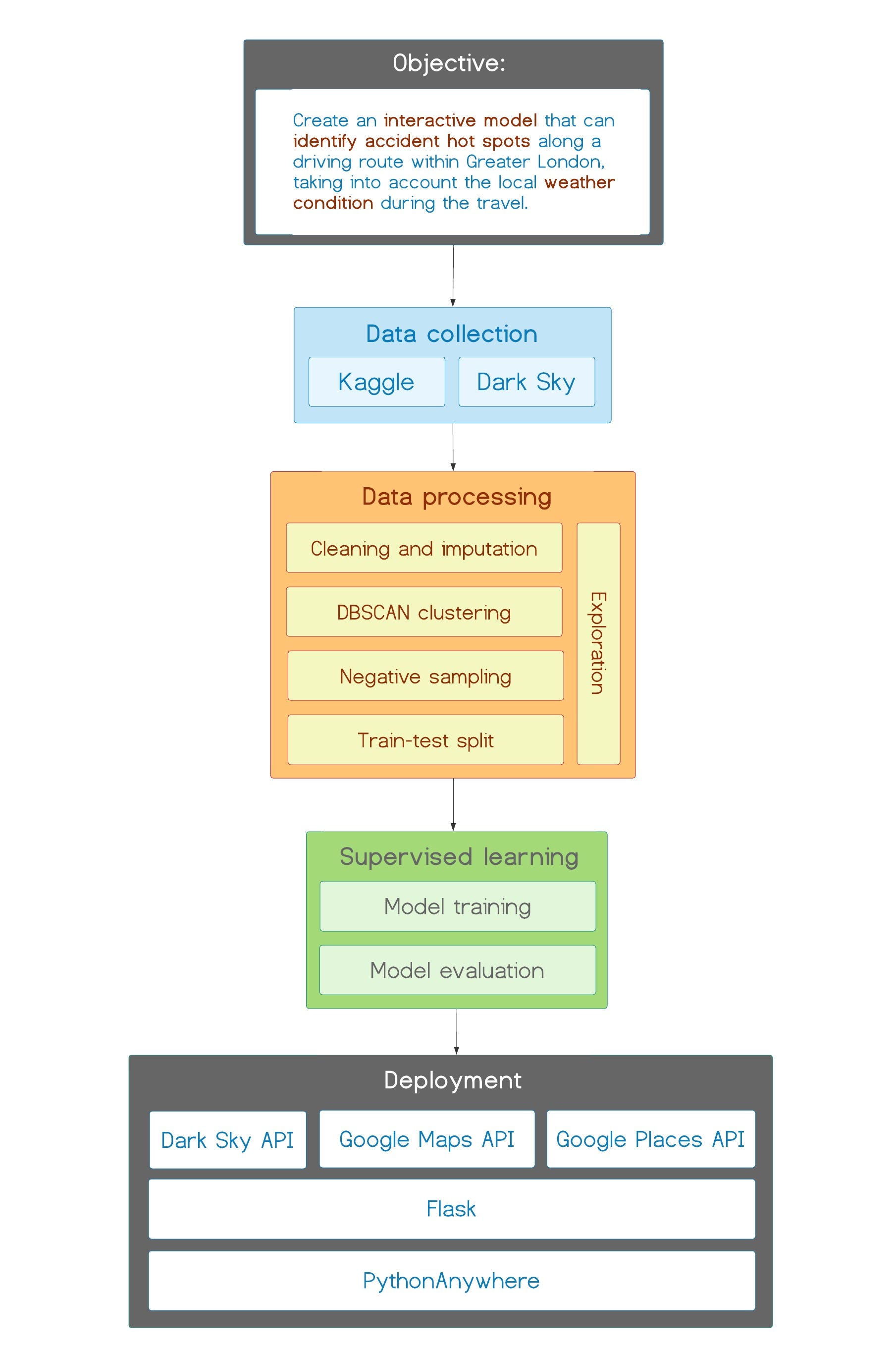
Steps in this project
Data collection
Having defined an objective, we proceeded to look for the necessary data. The following are the two data sets we finally chose:
Kaggle
The main data set we used for this project was a detailed accident record published by the UK government and hosted on Kaggle. This data set contains details about 1.6 million traffic accidents that took place in the UK between 2000 and 2014. It consists of 33 columns which capture details such as the location, time, severity of the accidents as various meteorological and traffic backdrops. In this project, we restricted ourselves to analyzing traffic accidents in Greater London between 2012 and 2014.
Dark Sky
We believe that weather is a particularly important factor in road accidents. Although the aforementioned Kaggle data set contains meteorological information, we didn’t think that it’s sufficient. There were the two issues about using the weather_condition column of the Kaggle dataset:
- It assumes that weather is constant throughout the day. If you’ve ever been to London, you know why this assumption is problematic — the weather there changes very frequently!
- It only contains historical weather records (obviously!). In order to use weather_condition as a predictor for future accidents, we need a way to get a weather forecast
Because of these reasons, we decided to instead make use of the meteorological data provided by Dark Sky, an American company that specializes in weather forecasting. Dark Sky provides both past records and future weather forecast, which perfectly serves our purpose.
Data Preprocessing
Upon exploring the data set, we found that almost every street in London has once been an accident site. This makes sense— London is a bustling city where traffic accidents (including minor ones) happen very frequently. The picture below, created using Tableau, superimposes accident locations (red dots) on the map of London. Notice how the whole city is bathed in red!
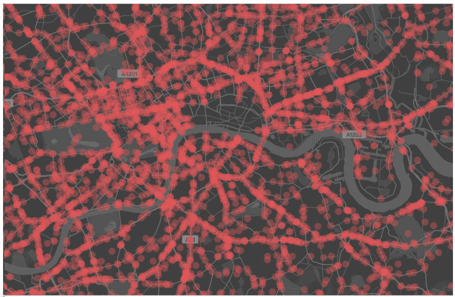
The city of London. Each red spot indicates an accident between 2012 and 2014. As we can see, London is full of (historical) car accidents!
Although accidents have happened all across the city, some areas are more accident-prone than the others. In order to systematically identify these accident hot spots, we grouped the aforementioned accident locations into clusters. We defined a cluster to be an area with a cross-section of 25 meters in which at least 14 accidents had occurred within the two-year time window.
We used the DBSCAN algorithm to perform this clustering. DBSCAN was chosen due to its speed, its ability to find arbitrarily-shaped clusters and its robustness to outlier. The accident spots that fall outside of the clusters were regarded as outliers and were excluded from our subsequent analysis.
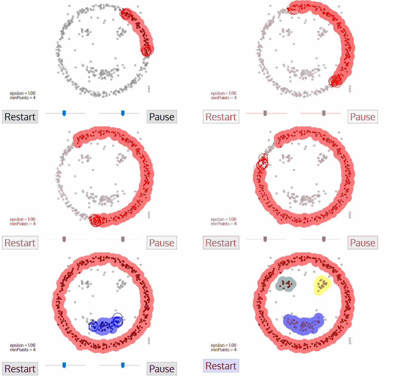
A depiction of how DBSCAN works
The DBSCAN clustering step resulted in the discovery of 473 accident hot spots. These hot spots were visualized below using ArcGIS, a software for geographical analysis. We can see the hot spots are concentrated on the major roads of London such as A11 and A13.
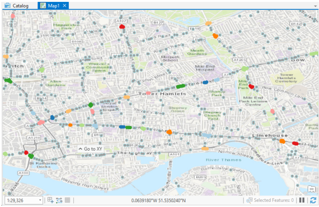
Accident hot spots in London
Negative Sampling
At this point, we had several hundreds of accident hot spots. One thing I should clarify — these hot spots are not accident-prone 100% of the time. For instance, accident hot spots along London’s main arteries might be risky during the rush hours but relatively safe during quieter times. On the other hand, hot spots in a sharp turn might be pretty harmless on a bright, sunny day but might become mortal on a snowy or rainy day.
Thus, our next task was to find out under which conditions these hot spots are “activated”. Framed this way, our project now became a classic binary classification problem: we needed to find out the combination of factors (e.g. weather, time, etc) that would “activate” a hot spot.
However, our data at this point weren’t yet sufficient to create a classification model! Training a classifier requires both positive and negative samples, but we only had positive ones (i.e. records whose is_accident target label is 1). Thus, we needed a way to generate negative samples (i.e. records of “non-accidents” ).
The generation of negative samples using positive samples had previously been described. We followed a method described by Yuan et al.¹ In essence, this method entails the random generation of three negative samples for every positive sample in the cluster. For instance, if we had a cluster located on Abbey Road in which 15 accidents had occurred, we would randomly synthesize 45 records of non-accidents for this very spot. Except for their location, other predictive features of these negative samples, such as date and time of the non-accident events were selected at random. Caution was taken so that these randomly-synthesized negative samples did not coincidentally match the real positive samples.
Exploration and Observation
Upon exploring our cleaned data set, we made several interesting observations. Some of the more interesting observations are elaborated below.
Which months are road traffic accidents most likely to occur?
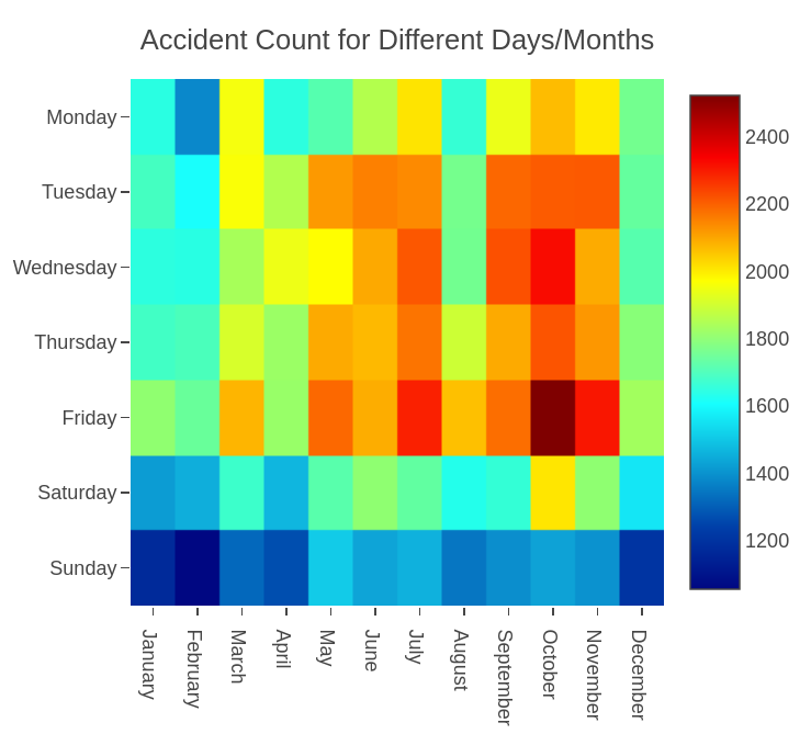
The heat map above shows how many accidents have occurred for each day of the week in all calendar months. We can see that the months of September until December are characterized by a relatively high frequency of accident. These are the months of autumn in London, which are characterized by low temperature, fog and rain. Counter-intuitively, fewer accidents take place in the chilly winter months of January and February. This might suggest that people are more reluctant to drive during this time.
What time of the day are road traffic accidents most likely to occur?
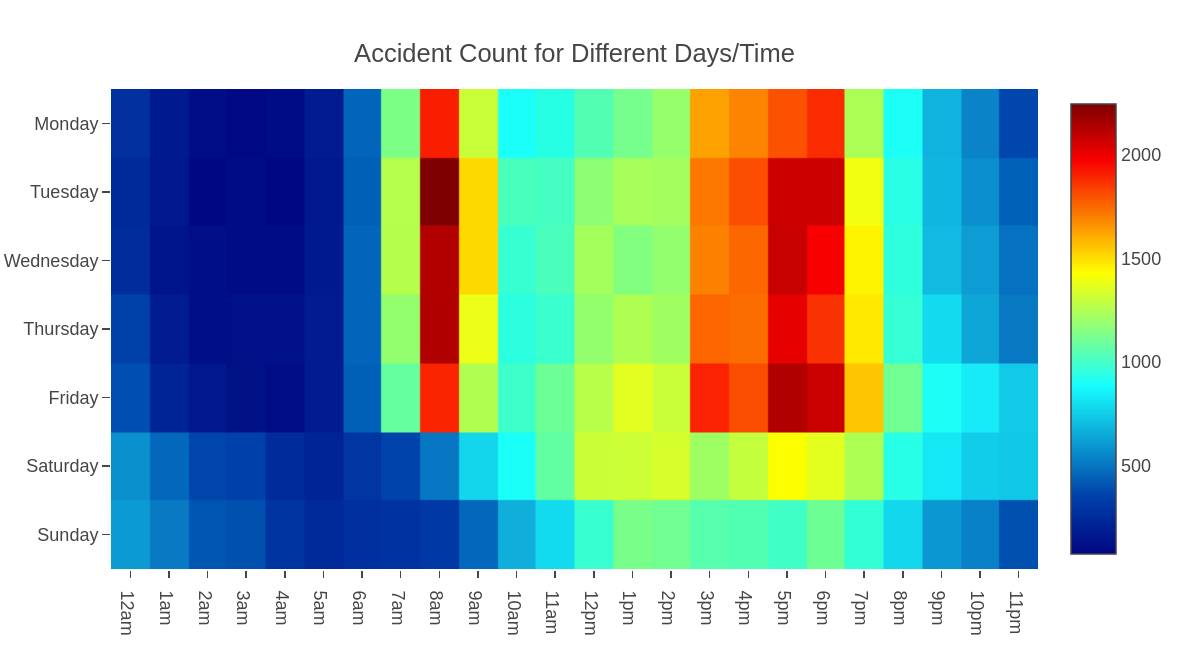
The heat map above shows how many traffic accidents have occurred in each hour for each day of the week. We observed that unsurprisingly, most accidents transpire during morning rush hour from 8 am to 9 am and evening rush hour from 3pm to 7pm (purple blocks). Friday is particularly bad.
How many vehicles are involved per accident?
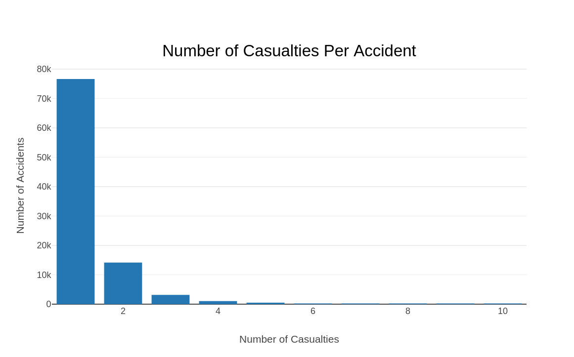
The bar graph above shows the distribution of accidents based on the number of vehicles involved. It indicates that most accidents involve one or two vehicles. This intuitively makes sense; most accidents happen as a result of a c ar veering off the road and/or collision between two cars.
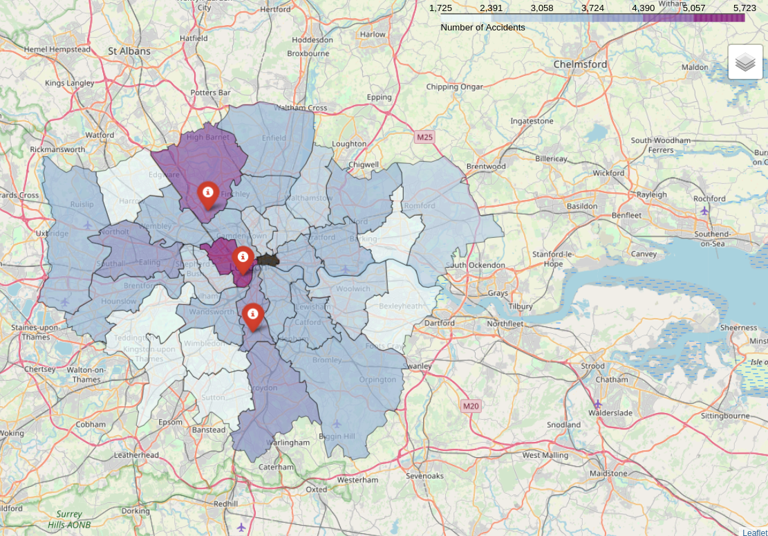
In which boroughs do traffic accidents occur most often?
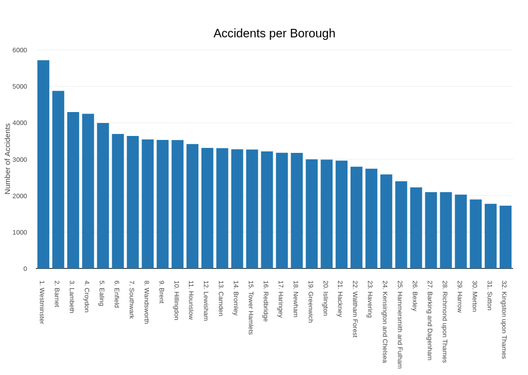
The bar graph above shows the distribution of accidents based on the number of vehicles involved. It indicates that most accidents involve one or two vehicles. This intuitively makes sense; most accidents happen as a result of a c ar veering off the road and/or collision between two cars.
Supervised Learning
SWith the aforementioned pre-processing steps, we were finally ready to proceed to the modeling stage! We split our data set in a 70:30 ratio into a training and testing data set.
Python’s scikit-learn library was used for model training and evaluation. We attempted common classification models such as SVM, logistic regression and random forest. The models’ relative performance was measured and compared using accuracy and area under Receiver Operating Characteristic curve (AUC-ROC). The results of our modeling steps are summarized in the table below.
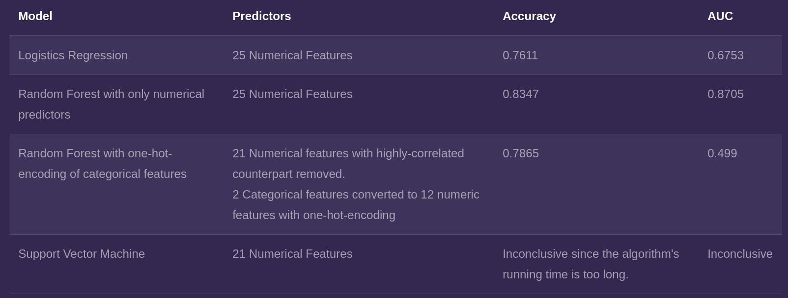
We found that among the models we tested, the best performing model was random forest trained on only numerical features. This was the model we selected for deployment, a process I shall describe below.
Deployment
We then packaged our scikit-learn model into a web application using Flask, a Python web framework. The front-end display of the website was built off of a free template taken from the website HTML5UP . All the html, javascript and CSS codes were integrated in to the Flask application.
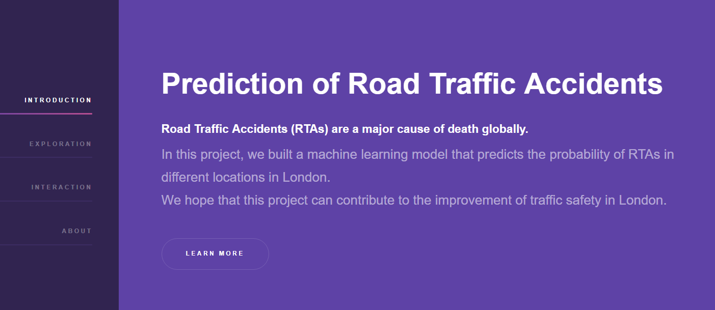
The application was then is then made online by PythonAnywhere, a Python-focused web hosting service. You can visit the website on kteo7.pythonanywhere.com. Here is a screenshot of the website:
Now I’d like to provide more details into the workings of the Flask application.
On the front end, there are fields where user can input the origin and destination of their choosing. These text fields are equipped with Google Places API that provide autocomplete feature. There is also a drop down menu with which the user can pick a date/time (can be past, present, or within 48 hours into the future).
Once these inputs are made, a POST request is sent to the backend framework. Here, these inputs act as arguments to the function call_google. Given an origin and destination, this function will call a Google Maps API that will return the best driving route connecting the two. More specifically, the function returns the latitudes and longitudes of the route’s waypoints, which are regularly-spaced points along the route.
The latitudes and longitudes serve as inputs to another function called calc_distance. This function “draws” imaginary circles with a radius of 50 meters from these waypoints and checks whether or not there are any accident hot spots that fall within these waypoints.
For each cluster falling inside the circles, yet another function, call_darksky, makes a request to the Dark Sky API. This function will return the weather forecast for the spot in the specified time.
With the weather data, together with the information on the date/time information, the final predict function will perform a binary prediction on whether or not the hot spots of interest are “activated” under the chosen weather/time. These predictions are then sent to the front-end, which will display them on the screen.
The gif below shows our interactive model in action. Here, I picked a future date and time, chose an origin (Hyde Park) and a destination (King’s Cross). We can see that the model chose a route that passes through Gloucester Place and A501 and flagged the busy intersection between these two roads as a potential accident site.
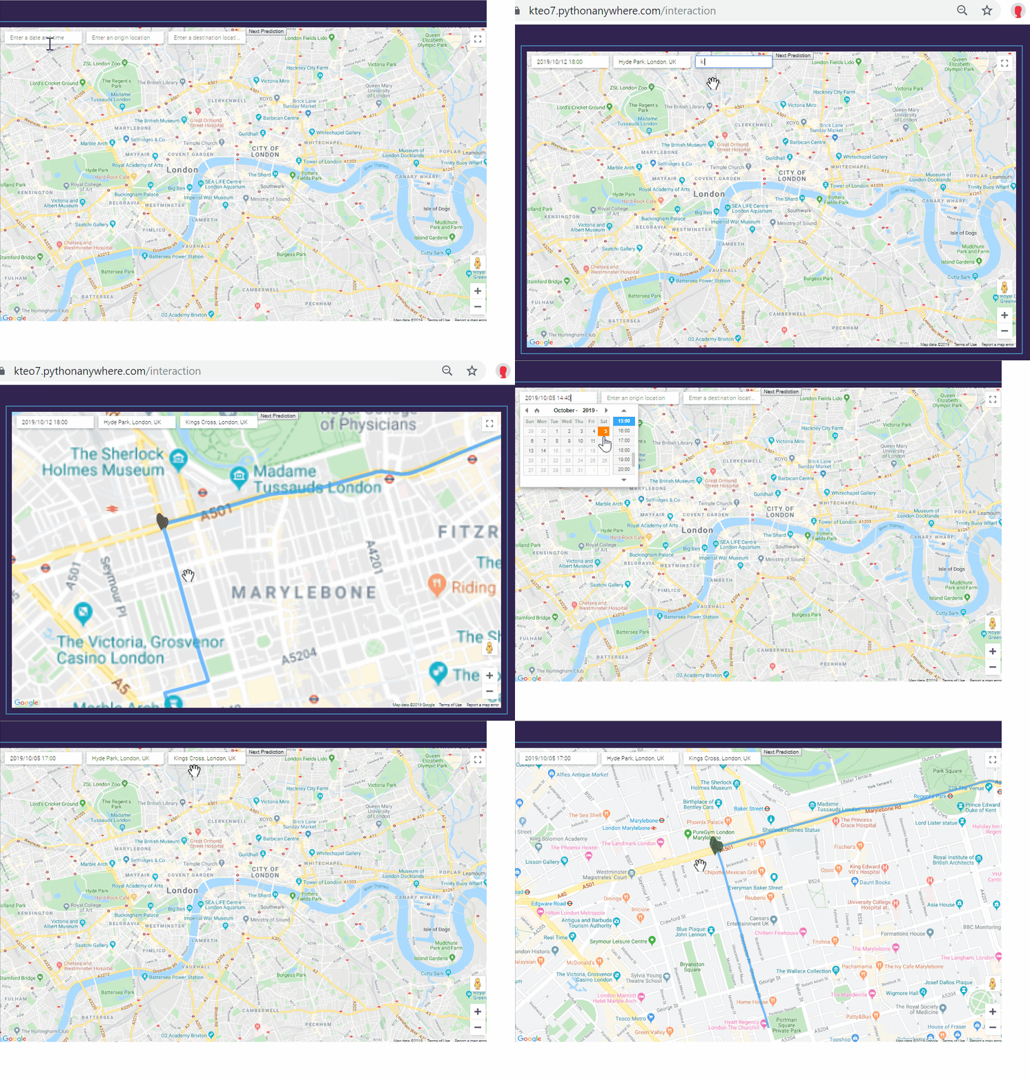
Again, you can access this model on kteo7.pythonanywhere.com. I encourage you to play around with it while it’s still active (it will be active until early 2020).
Dope! Now let’s talk about your use case. You told me that you facilitate the analysis of Big Data. Could you go into specifics — what are scenarios where someone should use you?
In my experience, people use me for two things: extract-transform-load (ETL) pipelines and ad-hoc queries.
A typical ETL pipeline loads in a data from a source, clean it, transform it and store it somewhere. An example is the processing of log data of a particular website. Using my FILTER function, one can clean these logs by filtering out data coming from automatic bots and internal views. I can also perform transformations that enrich the original log data. For instance, I can group these log data by the countries that the visitors hail from to provide more fine-grained view of the data.
My other common use case is research and ad-hoc queries. Traditionally, these are done using SQL. However, if the data set to be queried is unstructured and contains “complications” such as nested structures and missing values, I may be a better tool. My flexibility and extendability lend themselves well for such cases.
I hope you enjoyed this article! If you have any questions/comments about the article or would like to reach out to me, feel free to send me an email at meraldo.antonio AT gmail DOT com.

Leave a comment